😶🌫️ 🧠
Some work of mine
A glimpse into the way I tackle opportunities.
CarMax App
When thinking through the next generation of iOS and Android app at CarMax, we knew from customer discovery over the years that it needed to be a few things that it was not then…Personalized, Unique and Enabling. Below, I’ll walk you through a high-level of the research we conducted and solutions we brought to life and testing in the hands of customers across multiple stores.
We first evaluated and documented a process that lent itself to unique opportunities in the mobile space, which was the at store experience. The app has traditionally been a shopping and lead gen tool, similar to the website. We didn’t want to be in the business of creating an alternative to the website, but rather a supplement to the web experience. By letting the website handle the heavy upper funnel action, how might we create a smooth hand off and craft unique to mobile and “no way it can do that” moments in the app? How might we use mobile technology to reimagine the in-store experience?
We started by understanding the existing in-store customer experience…
Contactless Test Drive
From discovery to strategy to execution and iteration, we let research to guide and uncover opportunities and to dial in the execution to truly exceed Customer’s expectations.
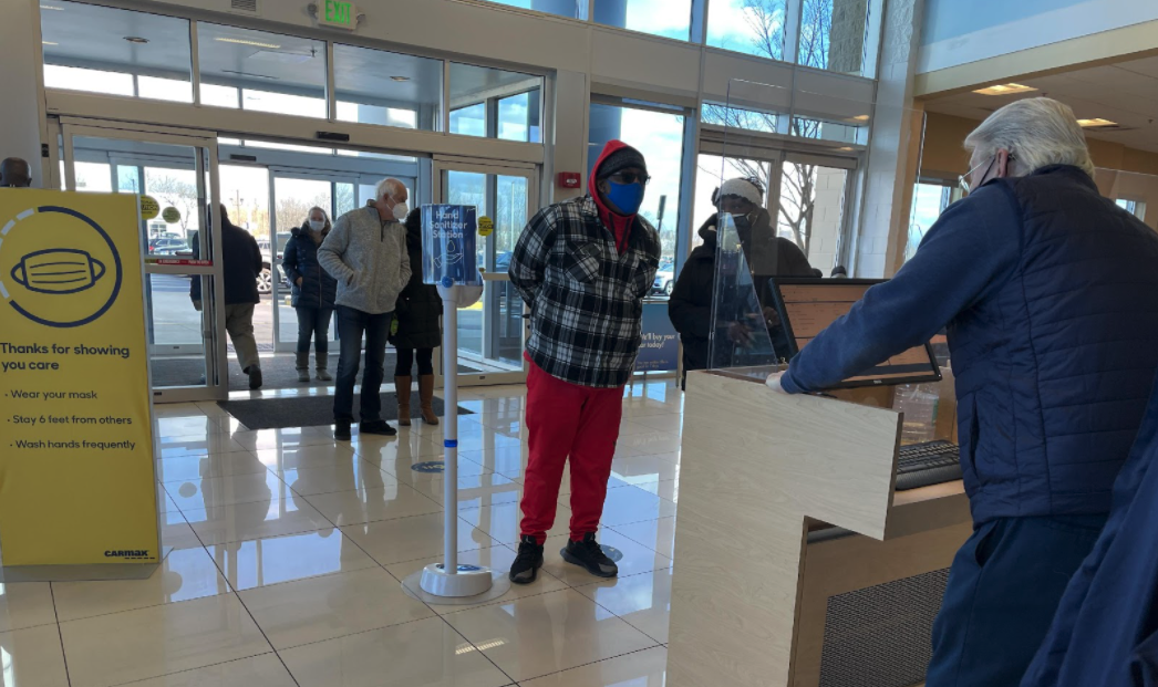
The line to a manual check-in process grows as lunch time nears
A manual book of test-drive forms Associates need to distribute to customers prior to a test drive.
License plates that need to be checked out vis legacy technology.
Mapped out 3 segments of customers that frequent the store for a test-drive and mapped avg. time to task
While we did spend a fair amount of time mapping and researching the existing Customer experience, we could not ignore the pains in the CarMax Associate experience because after all, the pain and hiccups in their experience trickle down and are felt directly by the customer.
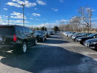
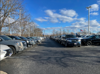
Below, you’ll see an example of what is described above. In some busy lots, inventory are double parked, moving around all day for test drives and cleanings so finding a vehicle is pretty impossible sometimes. We witnessed multiple Associates take Customers to their car and it was not in the previously marked spot. Then the Associate started to wonder around looking for the vehicle, all while the customer is starting to form doubt in their mind and wonder if CarMax sold a car they called dibs on as long as a week ago.
Between the waiting in line to check-in, waiting up to and sometimes more than an hour to speak with an associate, not being able to test-drive a car until an associate can help you and the amount of time it takes to get in the test-drive even then…we knew there was opportunity here.
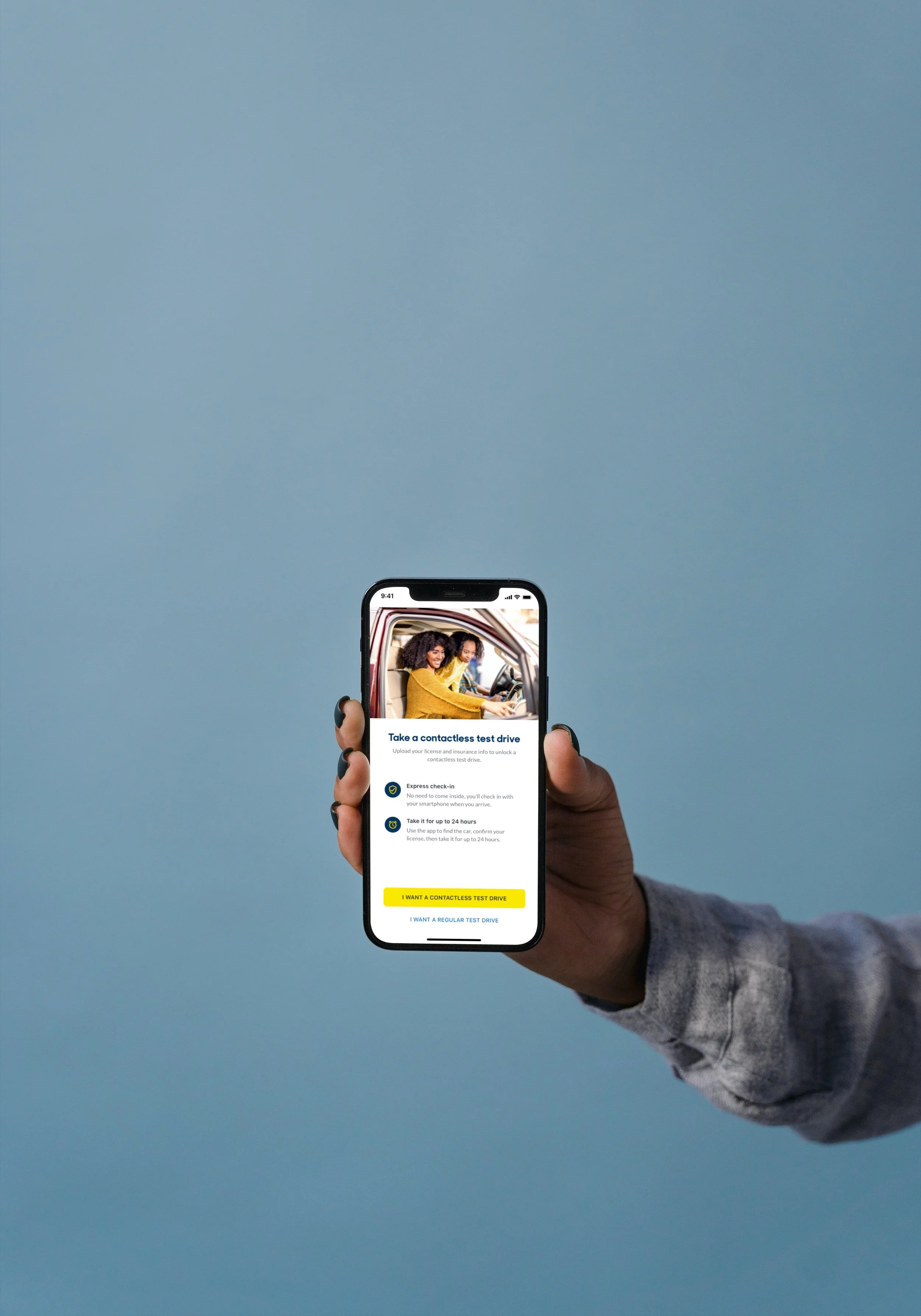
We introduced Contactless Test Drive as a single store pilot.
The idea of Contactless Test Drive was born from the various issues we saw during our months of research and how it really impacted those who had the highest expectations of all…customers who scheduled a test drive appointment.
MVP Experiment flow with ideation organized at the bottom and all edge cases accounted for.
Once we tested service flows with Customers and Associates in the store, we designed out the screens we’d need.
Alternative Concepts & Experiments
While we were focusing on the section of the customer experience where Customers were scheduling a test-drive, setting expectations for their store visit and eliminating the gap between arrival and sitting in their dream car, we had a few other crazy ideas to help smooth over the experience.
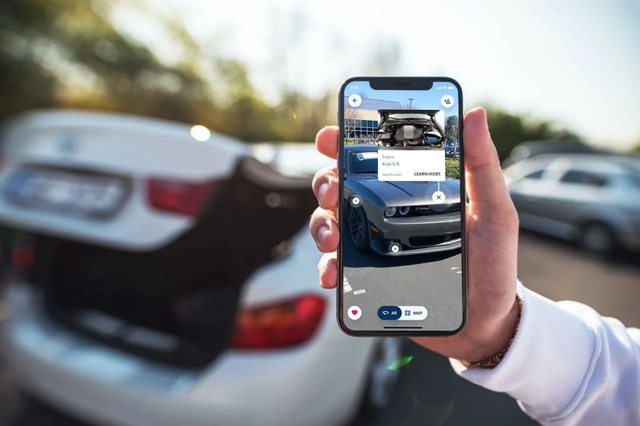
We released a pilot lot GPS to a few stores that allowed Associates and Customers to find their test drive and or find relevant vehicles on the lot in real time.
We also prototyped and ran discovery with an AR enabled utility that would provide an alternate form of guidance to their vehicle and also provide some helpful tips and info when they got to it.
Scott’s Cheap Flights

I head up the Design & Research teams here at SCF. The Design Team helps drive consistency in our user experience and design. Additionally, we will be building empathy and a deep understanding of our current and future members so our products best reflect their desires and exceed their expectations.
CarMax

The History
The first CarMax used-car store opened in September 1993 with the tag-line of, "The way car buying should be". Since then they have led the used car industry, innovating it in many ways. In 2014 CarMax took its first attempt at creating an e-commerce like experience on their .com platform, with the ambitions that customers would be able to select, review and finalize their purchase from home, before coming into the store. Being the product organization was immature at the time, the initial numbers were a little frightening so they turned the few store test off, thus killing their e-commerce aspirations.
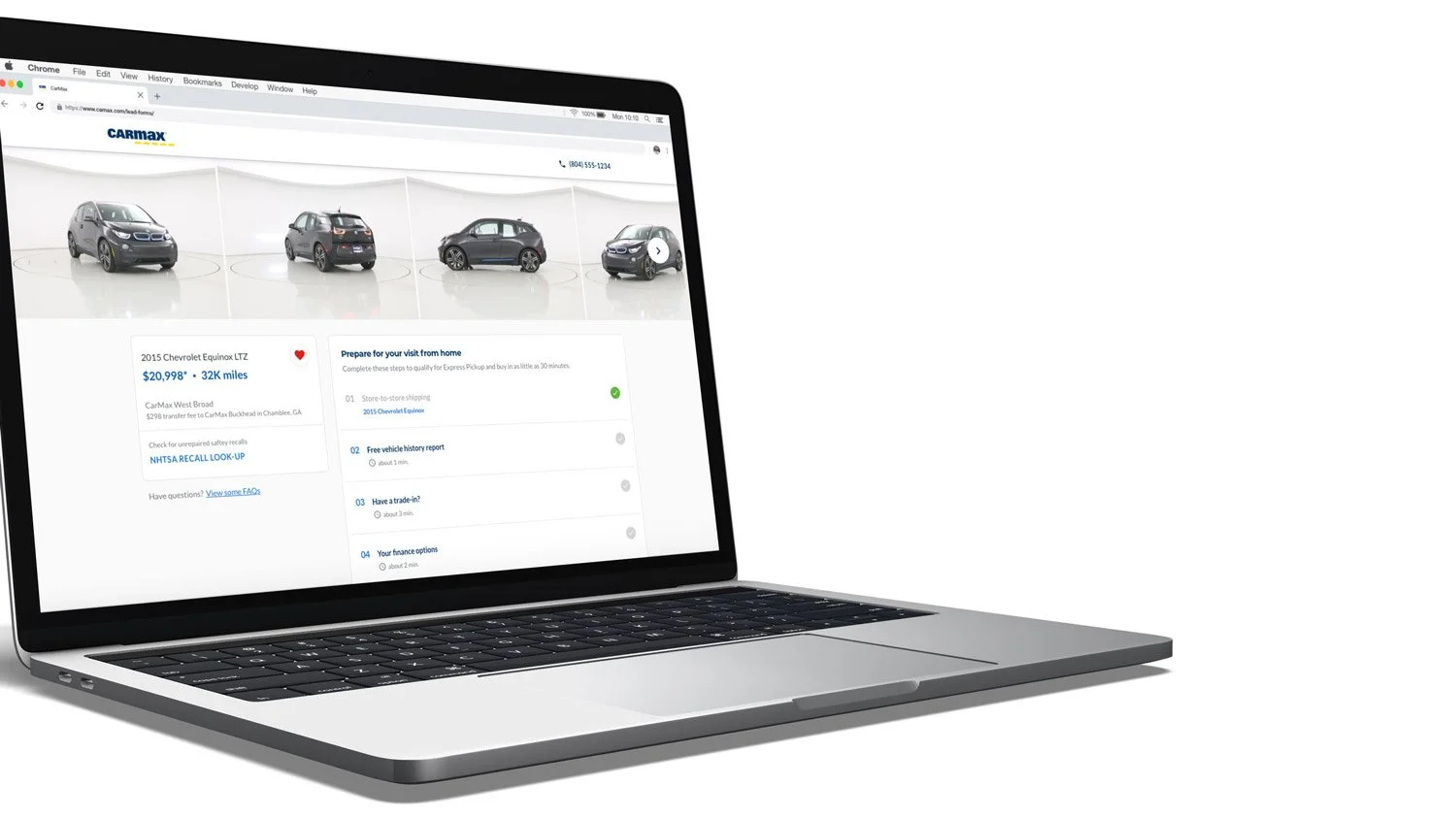
Being so quick to jump to conclusions and to learn from their failures meant it was business as usual. As you could imagine, the process of aligned and simplifying data structures from these legacy systems (early 2000's) and bringing in-store capabilities online across a company as big as CarMax is a long journey. Nothing we could just do all at once. So we have a rolling cycle of feature releases in which we are testing and analyzing all aspects of the business; how the needle is moving and why that is. Our first Self-Service Checkout release was quite small. Literally stitching together experience that already existed to make them feel as if they were one. Then, we slowly started to re-platform aspects of the buying process into our Self-Service Customer Checkout. As you can see from the flow above and the flow below, we a increasing the purchase process capabilities each sprint and quarter.
Discovery
n designing the Self-Service Checkout experience we really had to hone in on the type of customers that were searching for an alternative to the dealership. Throughout our research and audits of customers who have purchased with CarMax and competitors, we aligned on a design target that’s primary goal was to do as much of the buying process online as possible. This customer is confident in the vehicle choice and financial situation and have typically purchased a vehicle before. They're perception of of shopping online is defined by connivence and speed. Time is an invaluable currency for this type of customer. They could spend 10 hours at home and it still feels more convenient than 2 hours at a dealership and the most common quote we heard was, “I don’t feel like being at a car dealership all day, because that’s typically how long it takes...” and, “I don’t want to talk to anyone. I know what I want.”
A quick (and cliche) diagram to show the intersections of data and methodology we used in crafting our primary design-target, Derrick. This was a 3 month process that I led with the goal of unifying the Product Org around a primary customer, given out strategic goals.
Meet Derrick. He's our primary design target crafted by insights from qual, quant and marketing segment research. Derrick is a unified design target that will allow multiple product teams to focus on creating an integrated experience that delivers on our strategic commitment to sell a car fully online. For the last 1 and a half years, we've been talking to customers non-stop, hearing their stories and allowing them to help guide key design and priority decisions for the Checkout. This qualitative data was put against quantitate data we worked with the .com Analytics team to curate. We took a deep dive into the current Self-Service Checkout customers and broken them into segments. These segments were cut by customers who are currently hitting the online capability wall in the Self-Service Checkout experience. We then back tracked to see what their upper funnel shopping behavior was.
Derrick is our primary design target crafted by insights from qual, quant and marketing segment research. He is a unified design target that will allow multiple product teams to focus on creating an integrated experience that delivers on our strategic commitment to sell a car fully online.
Audit of the current .com experience that was the building blocks for several workshops in an effort to align and educate the product org by creating empathy outside of the individuals teams opportunity area.
There are several methodologies we use to conduct the research and techniques we use to synthesis the data. In this example; we conducted a remote moderated interview with a customer who recently purchased through Online Checkout, reviewed her in store records from Salesforce , listened to all of her phone call recordings from calls to the store, watched the screen recording of the CarMax Associates assisting her, and used Fullstory to view her online sessions. All of this to build a full picture of this customers experience.
We stay in a continuous discovery mode, testing design concepts with customers both moderated and unmoderated. For remote unmoderated tests, we would use tools like Usertesting.com and for remote moderated we would commonly use a tool called Ethn.io . This tool would allow us to pinpoint a specific page of CarMax.com which would trigger a survey. From this survey we would screen the customers and call them in real time to capture more accurate thoughts and feedback about their experience and expectations of shopping at CarMax. Having the full team involved in several discovery sessions each week utilizing different methodologies really helps the product teams become aligned around customer needs and gives us great material to relay to stakeholders about the decisions we’re making.
Buying used car is not the same a buying a shirt or pair of shoes online. The vehicle history, factory recalls, trade-ins, license plate registration, taxes and fees calculated on an individual basis, financing, required documents, driver's license scan, etc. This is some logic that powers just the trade-in estimate portion of Self-Service Checkout. Want to see the full resolution source file? View Overflow File
Want to see the full resolution source file? View Overflow File
Design & Delivery
Throughout the design process, I worked closely with our visual system design team to create components to add to our system and complete an overhaul of our system’s atomic elements like elevations, colors, typography buttons etc. This design collaboration would then extend to me leading a team of 6 designers into unifying the visual experience across the .com platform and store systems. This was because our customers would often do some online then complete the rest after their test-drive. The experience of picking up right where they left off online was very appealing to customers as it simplified their experience and cognitive load. Through this process we identified and created various patterns and UI to be shared across experience.
Specs sheet for development of the Finance Decision Card component that was consumed by the design system for consumption by other teams delivering finance decisions.
Small vehicle card, small appointment and status chip specs contributed to the CarMax design system.
Basic responsive grid and max-width layout templates for the Self-Service Checkout microsite.

Dollarshaveclub.com
NSRQ (NO SUBSCRIPTION REQUIRED)
Dollar Shave Club was always known for being a razor subscription company. As the company grew so did the way we thought about the business. With new products and sub-brands being launched regularly the interest and demand for them grew from members, non-members and past members. One of the major draw backs of the Dollar Shave Club parent brand for many consumers is they could only purchase our other offerings if they had a razor subscription. So, listened to the consumer base and decided it was time to knock down the barrier of needed a subscription to become a member of the club.
NSRQ is an acronym for, “No subscription required”. We will be rolling out the MVP of this initiative in Q1 of 2016 to all DSC digital properties (web + mobile). The introduction of NSRQ means that non-members can visit the site or app and make NRP purchases without a razor subscription being required.
As we evolve the business and our web and mobile platforms, the cart or, “Box” has to evolve it’s logic for different use cases and user states. This chart is a high-level peek into the different use cases for the box when it’s opened from the main navigation icon link and what primary elements it contains at any given point.
Integrating this business model into our digital platforms took much thought and careful auditing. We had to comb through every consumer facing touch point and create proper flows so that our past, present and future members did not feel confused or mis-lead.
With the phase 2 NSRQ test, we are introducing a test to see if people are willing to purchase a razor subscription if we present them an interstitial screen to up-sell a razor. We will be testing 2 different versions. In one, the guest will have the ability to select a single razor (4x or Exec) and the second test would be a more educational screen explaining the benefits of a razor subscription.
As briefly discussed in the user flows above, we had to design for all member types, which meant designing custom authenticated account pages for those different user states. Whether the member came in through purchasing a non-razor product, a razor subscription, they are a past member or they are an active member with a suspended credit card, their content hierarchy on their account page was different.
We not only had to create all these consumer facing changes, we changed the way the business looked at this members. We called this, the user states refactor.
BRAND PAGE REDESIGN
For 2 months we conducted many moderated and remote usability test to pin-point what exactly users were having trouble with in navigating dollarshaveclub.com. One big concern among many members and non-members was the display of our products and ability to way-find on our brand product listing pages. From these insights, we developed a strategy to create a flexible system that met the needs of many different departments throughout the company and most importantly, our users.
In starting the wireframe concept phase, I started wide and hi-level to explore structure first. As soon as we tested a few structured that worked we moved into more hi-fidelity wireframes to test out these concepts in execution. When creating a new tile structure for the website we had to consider all the permutations of that tile and how it could live and evolve, which took a tremendous design exercise.
As you've seen from the sample above we molded these tiles into every shape we possible could think of. Then we wanted to pressure test with the structure, so we created the document below to communicate to stakeholders what you could and could not do with the new system. We had to do this because rules are everyone's best friends when it comes to systematic design. When introducing a new system to the site, we wanted to make sure that it was not being abused. The company could use big tiles (2/3) or small tiles (1/3) in the grid.
DSC: Project Flow
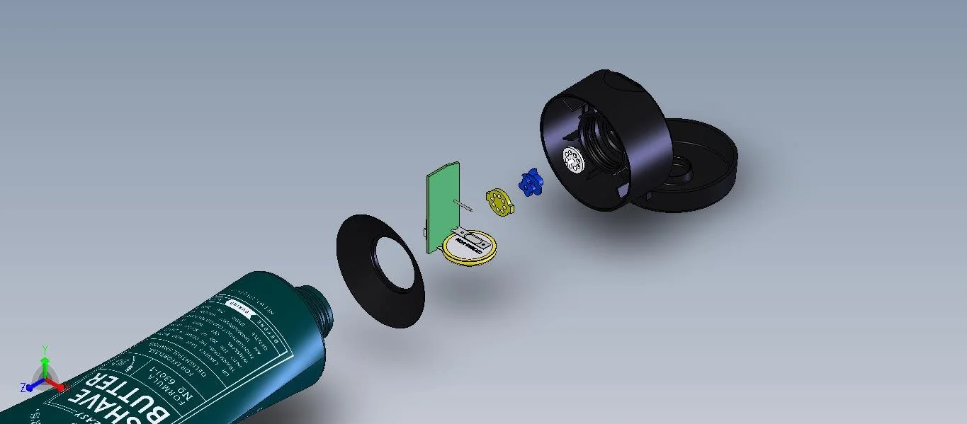
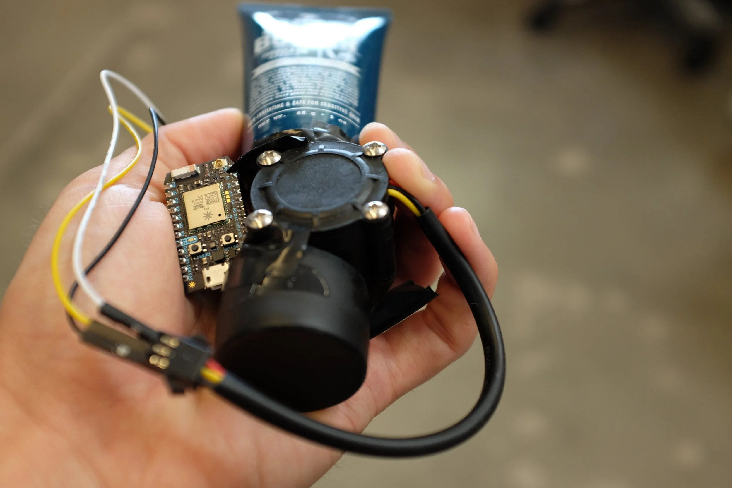
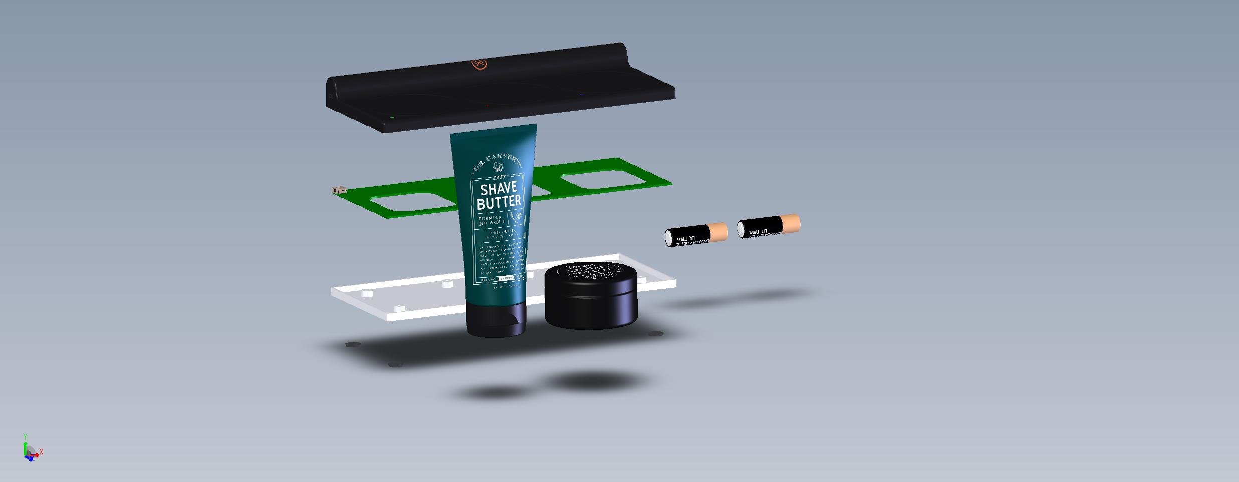
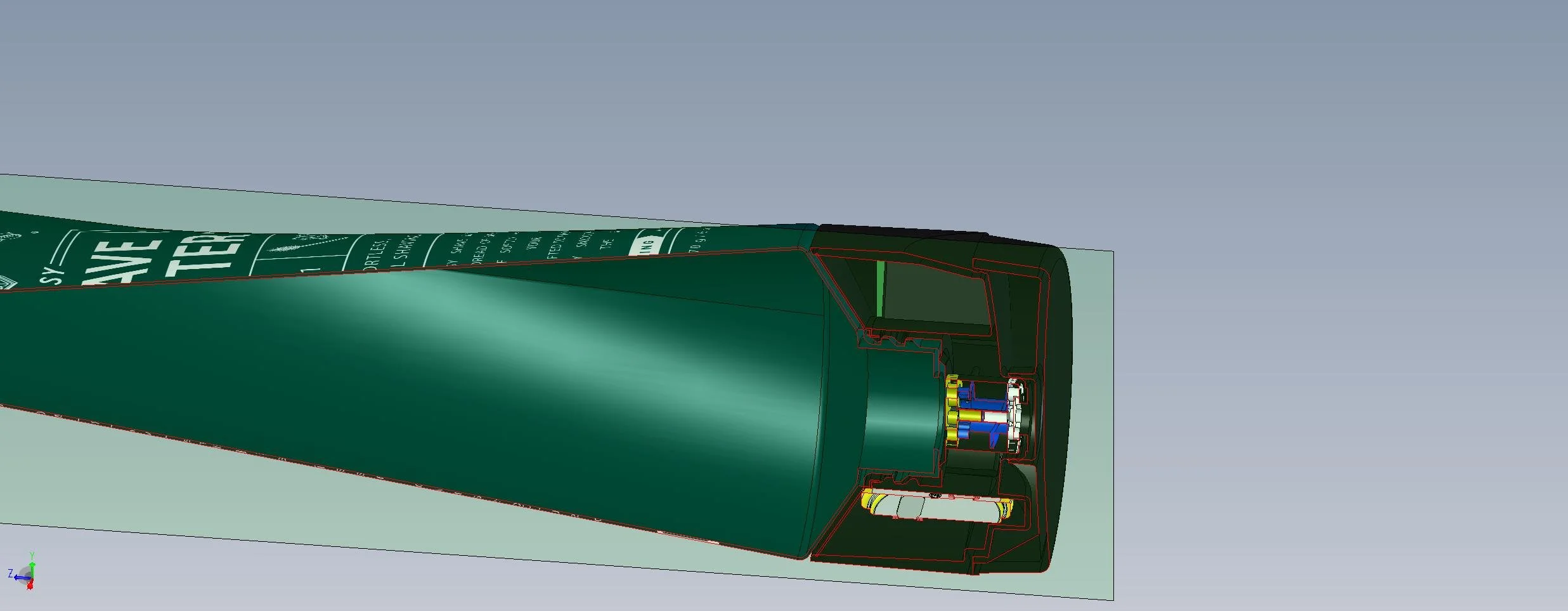
Original prototype for Project Flow…we called it, “The Shave Butter Bomb”.
Consumer products are used daily all over the world. The containers used to store these consumer products often include a container body to hold the product and some kind of removable or openable orifice to allow the product to be extracted from the container body. But consumers use these products without the ability to know how much is left, to inventory their use or analyze the amount left in the containers. Therefore, people have trouble keeping the right products stocked and purchasing the right products when the products need replenishment.
Likewise, manufacturers of products do not know which consumers utilize products, when they utilize products, and inventory levels in individual homes or workplaces. Therefore, manufacturers, who may know point of sale data, are unaware of more granular use data of any given product. Not only could manufacturers benefit from better understanding use habits of consumers and inventory levels, subscription services could benefit from knowing inventory in order to automate ordering and shipping of replacements, to minimize or eliminate a situation where a product has run out and no replacement is on hand.
The systems and methods here may be used to solve these technical problems with technical solutions that utilize sensors, wireless communications, and data analytics.
Patent #1: https://uspto.report/patent/app/20190156398
Patent #2: https://uspto.report/patent/grant/10,909,611
Using research, we flowed out the existing customer experience and uncovered some interesting pain points and opportunities.


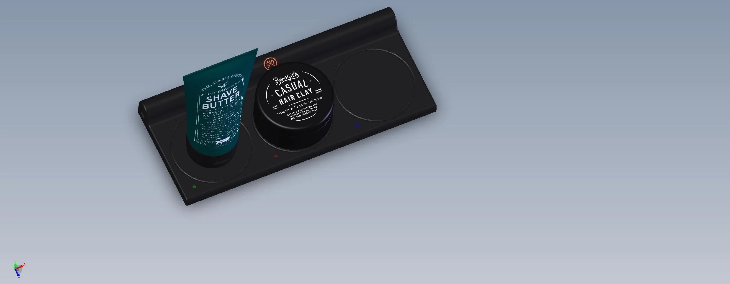
MVP flow detailing how Members could add the new Smart Cap offering to their next box, activate it and use it.
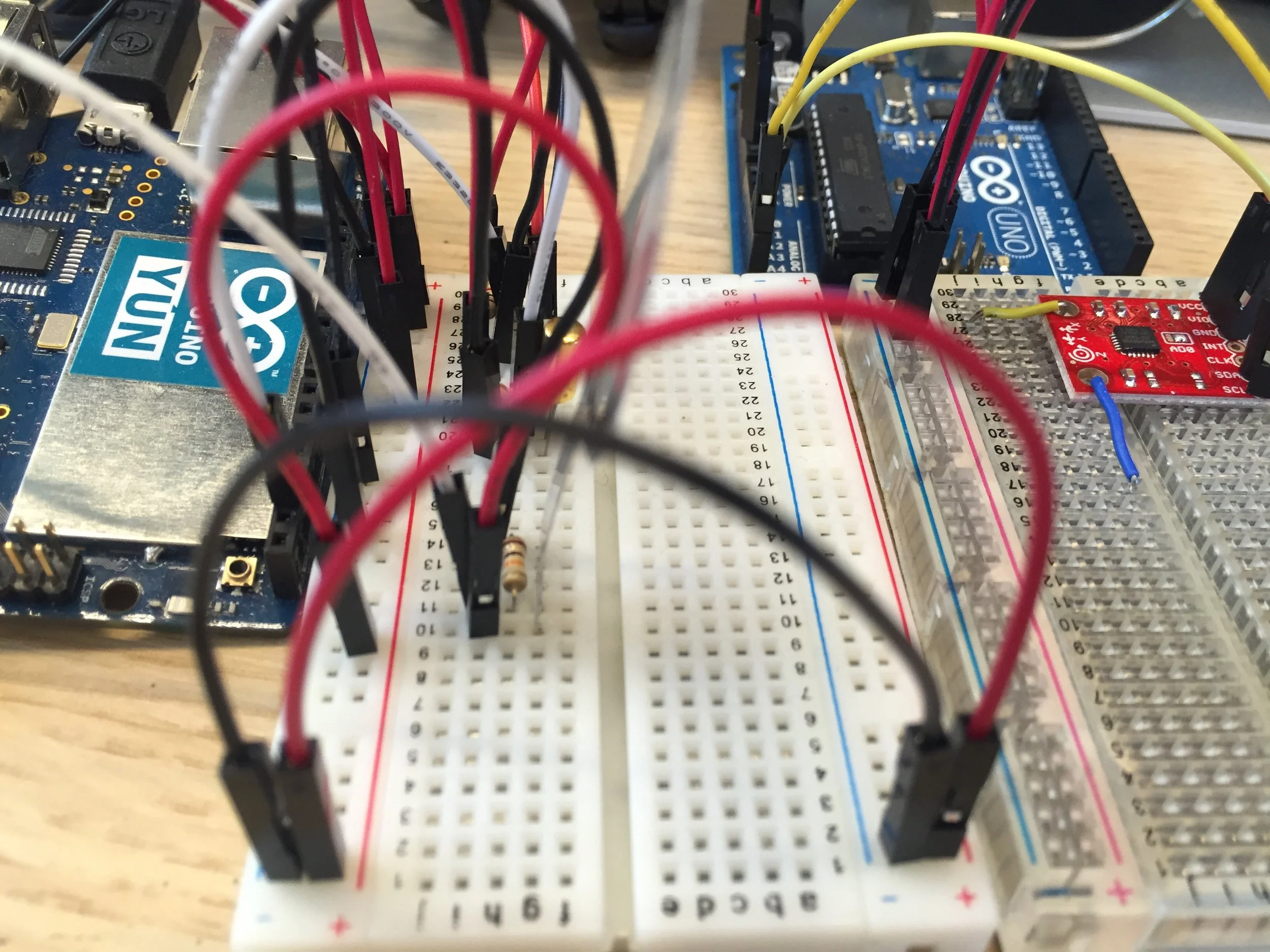
After weeks of discovery and prototypes galore, we began feeling out different ways this could come to live with the help of professionals (not me hacking stuff together lol).

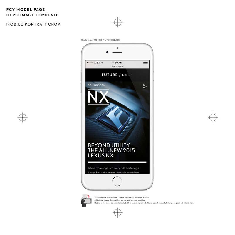
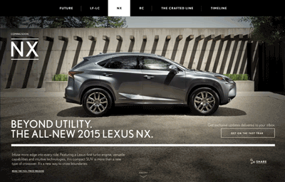
Lexus.com
How it started
As Lexus was redesigning their main .com property, there was a section that laid barren and untouched. As a team, we decided to work on the page and create something that the client would we completely surprised about but totally fall in love with. From strategy and flows to final design, we worked closely as a team for months, thinking of ever possible interactions. After all, a future concept vehicle page should look and feel like the future, right?
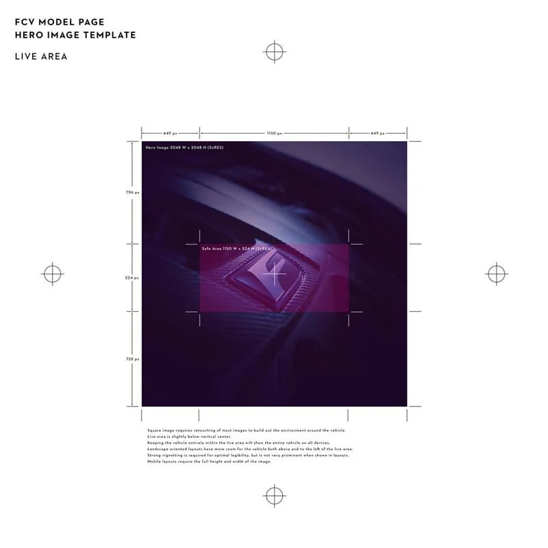
The problem was, that we normally would get new FCV model release images and teaser footage as little as a day before the car is released. This is why we built the final product as a scalable framework which would be flexible in any such situation.
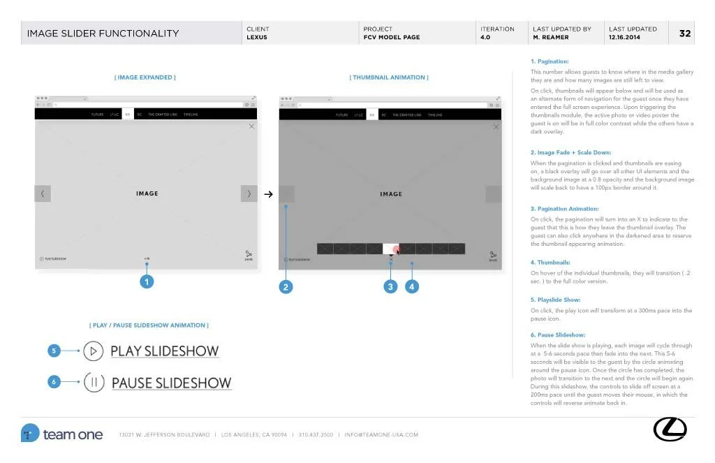
Process
For support documentation for the developers and sustaining documentations of the template for years to come, we created hero image treatment style guides, flex-grid layout treatments for various image counts and an extensive functional document that details mice-interactions and transitions down to the millisecond. As I always try to do, I worked closely with the designer and developer to make these documents happen.
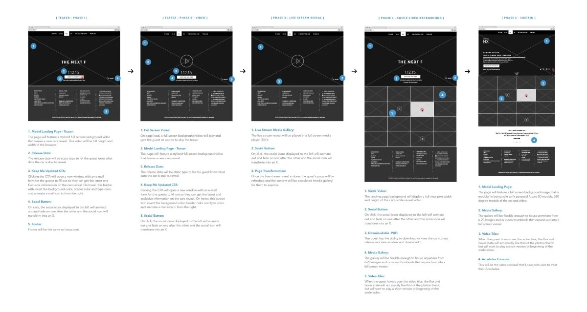
Along with the sustaining FCV templates, we also had to design out the teaser pages for the cars that would live 10 days on average before the launch date. There were 3-4 phases for each teaser, depending on the assets we received. So, this is another area in where we had to continue our flexible and functional design mentality, being careful to account for ever edge case.
We also scrapped together some rapid prototypes in order to sell through functionality to the client and rest of the team. We did a few coded prototypes and also some After Effects animated prototypes.
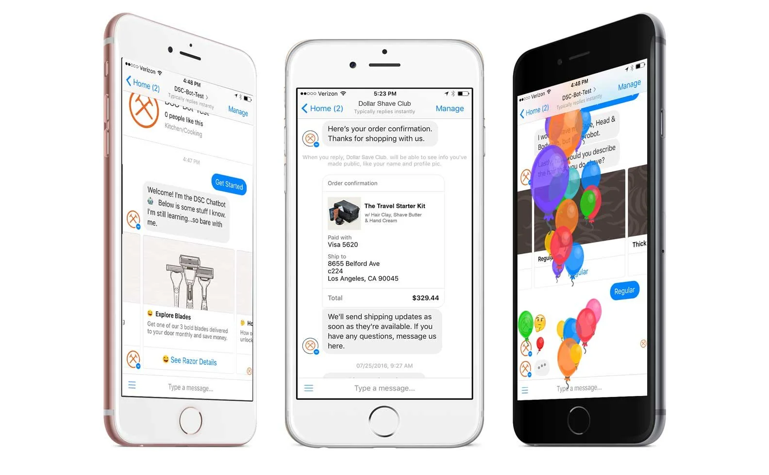
DSC Facebook Bot
PLATFORM OVERVIEW
While Artificial Intelligence (AI) is not a new concept by any means, it's still relatively new in the design realm. Engineers have been working at making AI and machine learning as a whole smarter and more independent for years. At Dollar Shave Club, our brand has something unique that no brand in our category and not many other brands have, a defined and distinguishable voice and tone. From day one when our CEO Mike Dubin busted onto the scene with the outlandish and some would say daring viral video, it set the tone of the brand in a way that the Internet had not seen at that time.
Fast-forward 5 years and the way brands can speak to consumers has changed dramatically. We've got new communication channels opening up every week and the main-stream is adopting these new channels at a rapid pace.
THE DESIGN PROCESS
When I was managing the Summer UX Intern, I gave him an assignment to explore how bots could positively effect both our brand perception and the end-users experience in finding the right products for them. Naturally, we started prototyping on Facebook Messenger platform, primarily because that's the channel that we spend a majority of our marketing and acquisition dollars. Oh, and it's our most effective / highest converting acquisition channel. We iterated through a few ideas and ended up with a bot that's sole purpose was to help you find the right Boogie's hair-styling product for your needs. As we shopped the idea and proof of concept around to different departments, we needed to work through a large bot strategy if it was to actually live.
DEVELOPING SCOPE & USER NEEDS
Like any project, what we thought we were building ended up being something completely different once it was built. Hell, it's probably different as you read this. We change(d) it everyday. Through our quant research and analyzing quant data, we evaluate the dead ends and what exactly people want out of this bot. Bots are different than any interface you'll ever design. You can think of a strategy, the best strategy you could possibly think of, but at the end of the day people will use it how they want. And bots, are the extreme case of this. The amount of use cases are hard to manage, which makes formal UX documentation kind of pointless. For something that is forever evolving, growing and getting smarter, what's the point?
In order to sell this channel in at the Executive level, we needed the bot strategy and data to prove why we should invest in it. By interviewing and gathering data from our Member Service team (MSA), we mapped the current MSA touch points with our members and the time of day. Doing this helped discover an opportunity, automation through Facebook Messenger. With 800+ messages from members a week (and growing) and a more than 24 hour response time, we could surely add a customer service layer to the bot which would eliminate 78% of MSA contacts through this channel. Those 78% of contacts we would be eliminated through automation are often times 'one-touch' tickets in which the member has a simple one response question.
As a business, DSC's goal is that we want to help members find the best grooming regime for them across our entire product portfolio. What started as a prototype that we were testing remotely with users, turned into something much longer. Essentially, this project fed into my OCD, really bad. But that's a good thing. I continued to refine and refine and refine. As guests and members would use the bot I would tweak flows multiple times daily and add to the Natural Language Processing (NLP) with every conversation. Eventually, the bot got to a really good place. Between the constant communication with the DSC Member Service team, guests and members, the NLP and overall MVP feature set of the bot was ready to launch. This process really helped open a lot eyes to people in the company. It helped them realize that we can invest little resources and little time to produce a platform or new channel to communicate with our members and potential members.
After calculating all of the current Facebook Messenger data we had available to use, we decided to start with FAQs and basic Member Service as we dove into the development of the bot. Daily, we would meet with the DSC Member Service team because they are on the front lines, speaking with and answering member concerns every second of every day. The whole Member Service team helped pin-point exactly what people were asking for and how they were asking. One of the first features of this track that we implemented was live-chat. This, we assumed, would be used quite frequently for frustrated members who just was an actual human to speak to. ChatFuel has a really awesome live-chat hand off to the Zendesk Messenger platform, which is what we leveraged for this functionality and to collect all Facebook Messenger tickets moving forward.
As we the Member Service portion of the bot became more sophisticated and functioned off natural language pretty smoothly, we transitioned into remote usability testing with real members and non-members. We ended up testing the bot in 4 different phases of its development with 50 non-members and 30 members. This helped uncover great features that help members beyond just FAQs and member help. Some of these features include: DSC Razor Match Tool, Subscription to latest DSC Original Content articles, search and read Original Content articles based on various tags, detailed flows of a few member favorite products and easy exposure to all of our grooming brands and categories.
Another insight from our usability testing was that whenever we enjected more emojis, fun language, non-sensical conversation or funny .GIF, the delight factor and love reaction we heard from the test participants was very noticeable. As the remote usability testing progressed we collected 5 words that described their experience with the bot and this interaction changed their perception of the brand, from each test participant.
Lexus Owner’s App
How it started
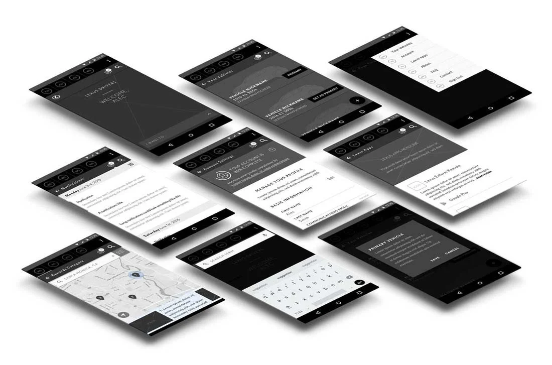
The Lexus Driver’s site is a utility product for Lexus owners to use as a resource throughout multiple scenarios. Over the duration of this project, wee had ambitious goals for the redesign such as hyper personalization of content, showing relevant data to the user from their vehicle by leveraging the OBD-II sensor in the owners cars and streamlining the current experience to make it more user friendly and fully responsive.
When I was brought onto the project, we were pitching for the business and I helped in crafting functional and visual prototypes and also refining design for the client presentation. Once we won the pitch, the team started to do content strategy and assents of the current site, competitive audits, stake holder interviews and surveying users.
Process
The sections of this mammoth site that I many focused on where Service (Service History, Safety Recalls and Service Campaigns, Scheduling A Service Event and Accessories), Account Registration and Forgot Password or User Name flows and wires and the Resources (How-To Video, FAQs and Owners Manuals). Throughout the process I had to audit How-To Videos and helped develop a strategy in how we can leverage SEO and overall server speed by embedding YouTube videos and wedding out content that was not up to par with current Lexus standard.
As always, I started with simple wireframe sketches that acted as a brain dump for me to get initial thoughts and visual hierarchy out onto paper. As we wireframed each section we had to keep all users in mind. Unauthenticated and authenticated users while also adding variables like users with newer model years, with older model years and even users with models that were discontinued and each of their experiences were slightly different.
I created multiple visual and functional prototypes to showcase functionality to clients and to internal teams. Using programs like Proto.io and After Effects, I was able to quickly give my functional designs justice
Interaction & Animation Guidelines
Something I really wanted to see come to life through The Driver’s Site was the implementation of the Animation Guidelines I was setting forth. Giving everything with motion a purpose and not making it an after thought. The concept that I was wrapping around every interaction, big or small, was the idea of meshing the physical with the digital ownership. With Lexus being a luxury brand and having precision, highly detailed vehicles, I wanted to add that level of polish and love to the brands digital properties. Through easing curve choices, and transition timing, we wanted to invoke a performance driven and smooth experience for all guests.
Android Application
The website design was winding down and I helped craft the registration wires + flow, the service section and resources sections of the site. Before I left the Agency, I started working with another designer on the team who was designing the iOS application in tandem with us designing the responsive. I started to set paradigms like navigation and setting best practices in place for the Android platform.
Apple Watch Concepts
As a part of the vision presentation to the client, we presented future concepts and extensions of how the Lexus Owner's App and website, eco-system we were building could live on other devices and serve other utilities. This is one execution, we showed them. Leveraging Apple watch technology, we can display car data in real-time as well as show contextual notification depending on the user's surroundings and current situation.
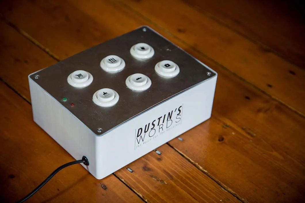
Dustin’s Words
Dustin is my 30 year old autistic brother. He was born with little to no oxygen in his body and had 2 open heart transplants in the first 10 years of his life. Growing up, I always said that if a Magic Genie ever granted me 3 wishes, I’d only need one. Help my brother be ‘normal’. I’ve come to realize that there is no such thing as normal and in fact, he is more normal than I am. But at least I could help him mildly communicate what he wants/needs. Help make his life a little less stressful. This device is the solution to this internal struggle I’ve been having and the life my brother has lived with for 30 years.
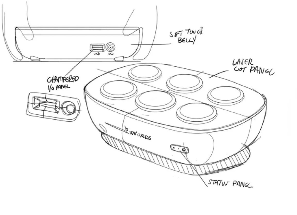
Dustin’s favorite past time is laying down and watching TV in his room. He loves it. This takes up close to 50% of his day and while he has developed a language that him and my mom understand slightly, it takes much effort and time to get his thoughts out into actions or words. In designing this experience for him I learned much more about him then I had known. This device had to be simple to use, not intimidating at the sight of it, iconographic language and a similar textile to what he is used to in his everyday life.
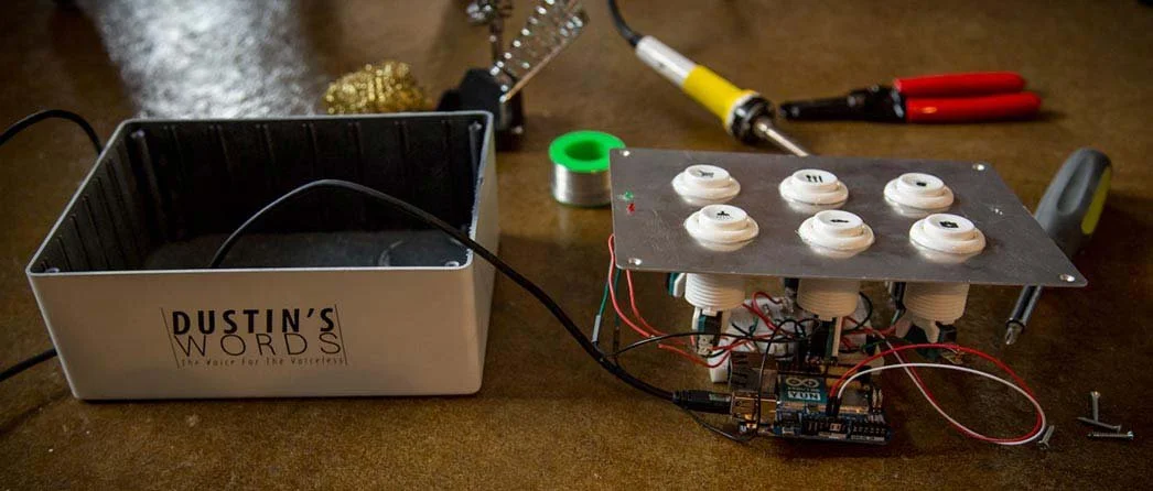
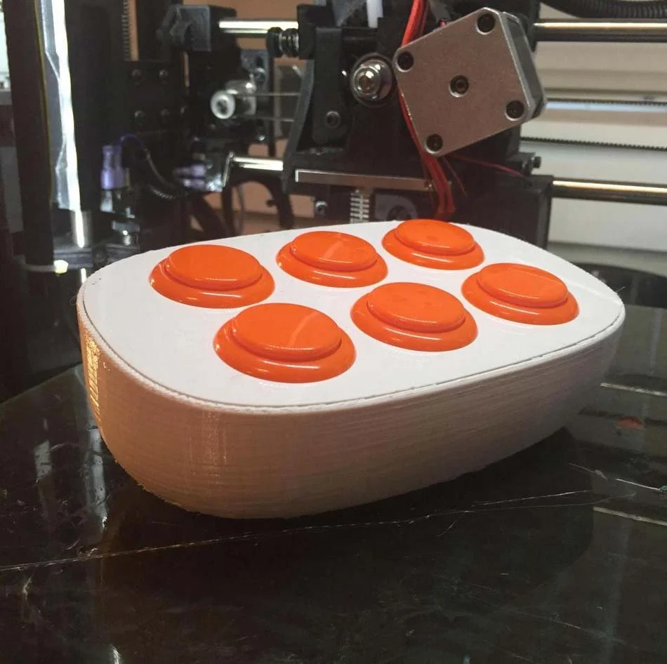
Dustin’s Words V1 Design
The idea was that it would be mounted on his wall, enabling him to hit one of the buttons that would send a text message to that actions dictated recipient. The choice to use arcade buttons in the design was due to their large size which minimize errors and incorrect button hits. Also, they are a familiar textile to him. Playing video games everyday, it’s something he’s comfortable with which is really important in someone who is autistic. The metallic surface is smooth to his touch and the all white external shell is soft on his eyes. The iconography language is very similar to the graphics he was shown in school and the everyday objects/feelings associated with them. A universal language you could say.
On-Going Testing & Iteration
We' ve went back to Richmond, VA from LA, and had a blast observing Dustin use his new and improved prototype device. He helped key us in on what we are doing right, what we can improve and also bringing functionality and features ideas to our heads that we had not previous thought of. It’s always super insightful to see someone use your product and see their successes and struggles.
We've also tried to test the device with others that have different complications in life that affects their verbal ability. A few families in LA were very helpful in providing us with insights and different perspective on how we could improve the functionality and utility of Dustin's Words.
As we looked through the current competitive landscape and discussed it with parents, caregivers, teachers and physicians, we found a niche in where we could fit. We found that our device comes way under the beginning prices of most on the current market and have less dependencies. Also, with Dustin's Words having the ability to send SMS messages, we can say that ours is the only AAC device on the market that allows this form of long distance communication and we are actively working to improve and add features everyday.
Thinking about every step of the process for every user and how we can make this product well rounded and to ultimately serve every person involved in the device owner's life. We wanted to create a way for the caregivers, teachers, parents and physician to become more aware and understanding of what the child is in need of or feeling. Making the device easy to set up is also a use case in which we concepted and created many flows for.
A wall full of awesomeness is what we have in the photo below. We tried to document our entire design process. We felt like transparency in our design process is imperative to meet our goal of attracting others in the community to help where they can. An inexpensive solution for nonverbal inexpensive communication is not going to be built by people in an office, but by many passionate people all over the world who have a vested interest in helping the people they love. This is why we open sourced everything we did.
This transparency helped us refine the Dustin’s Words device quicker. We could quickly gather input from really smart people and perspective from actual users/caregivers.
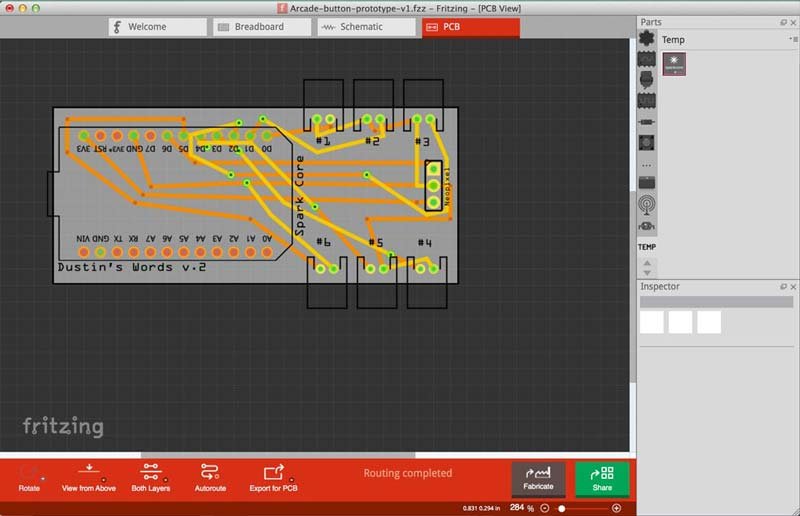
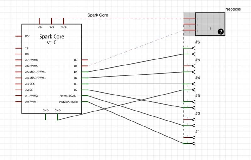
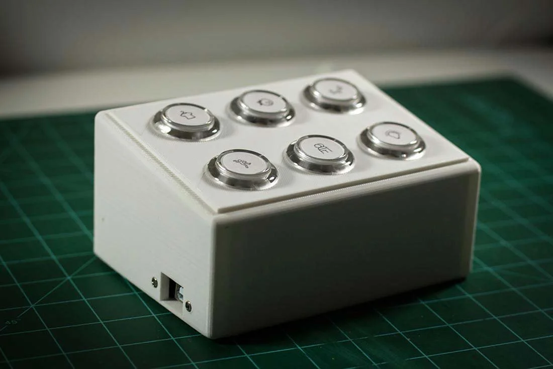
V2 Functionality Additions
Once we were ready to take it to the next level, we began working closely with and added a new member to the team that specializes in product/industrial design. Emmanuel (Industrial Designer) was a huge asset to us in thinking about Dustin’s Words as an actual scaleable product.
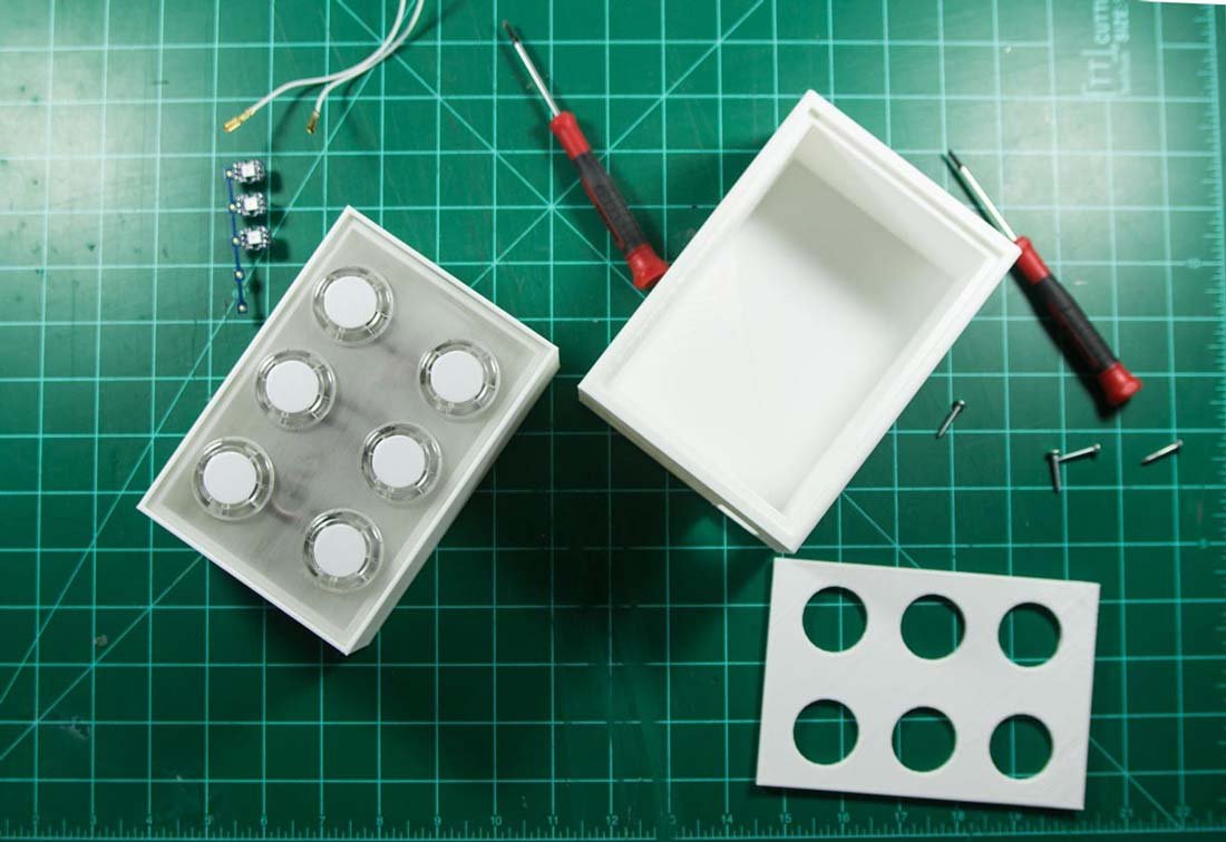
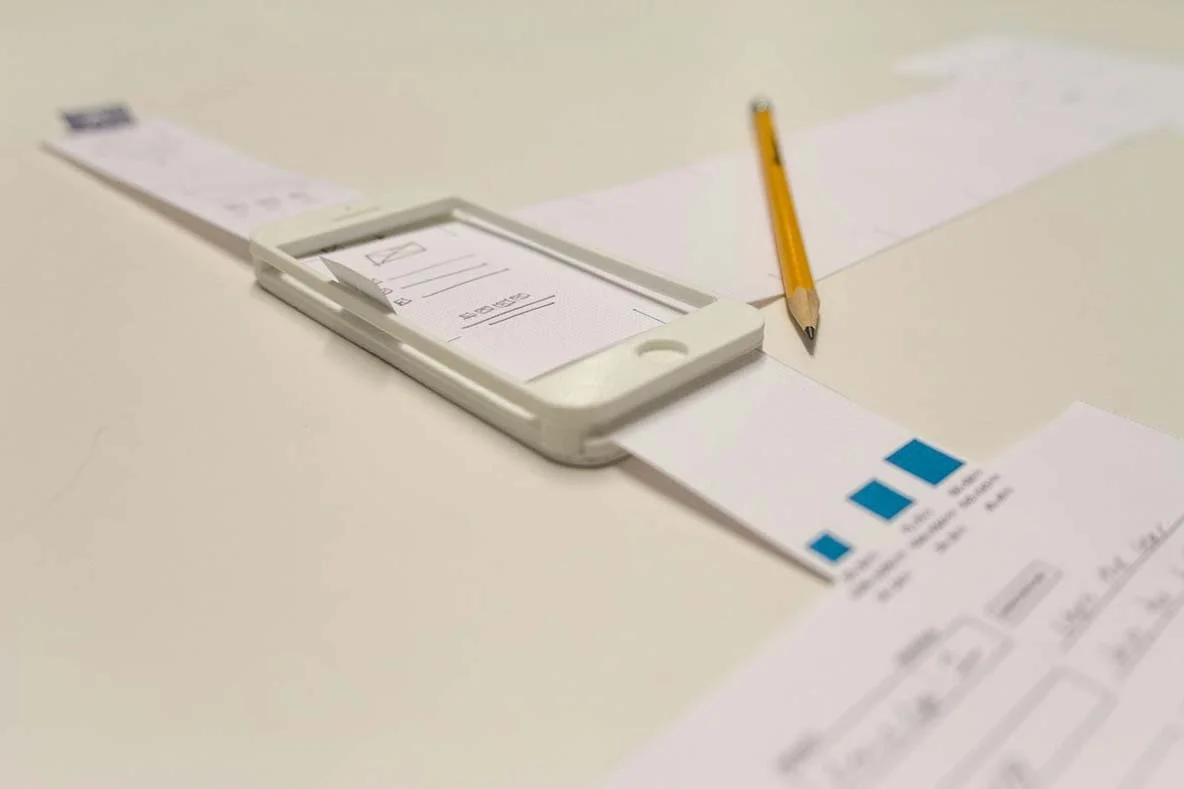
We even tested out some new button styles. The V1 used analog arcade buttons with manual cut and inserted icon paper. While this tested well and worked great as a low-fi means of communication, there had to be a more systematized way to create these. Our big idea was for caregivers to have the ability to swap out icons as they need through a web app and the digital button displays also give us the ability to open the device up to two way communication, not just one.
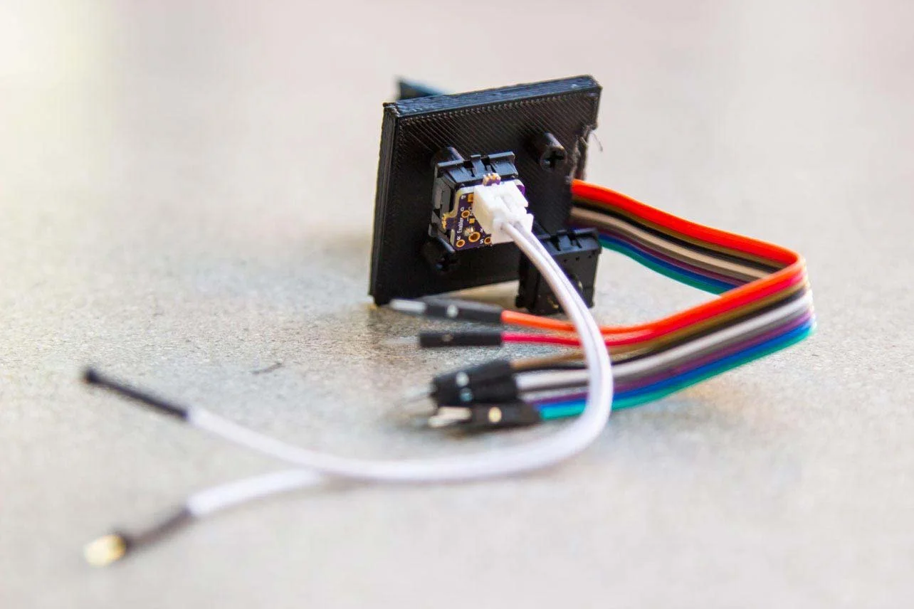
What we have pictured below is an exploration we have been taking which mashed an LED display and cherry switch keyboard keys. We combined these 2 with a 3D printed enclosure. As we looked for off the shelf solutions, we didn’t find anything that fit our visions.
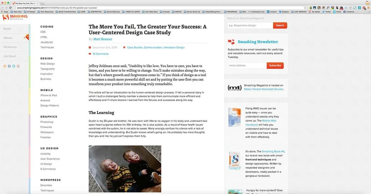
Press Coverage
As I began to write freelance for Smashing Magazine , I wanted to make this my first published article. One because it was so close to my heart and second because I think the application of basic User-Centered Design principles could really shed some light on the subject for beginners in a way they could relate too.
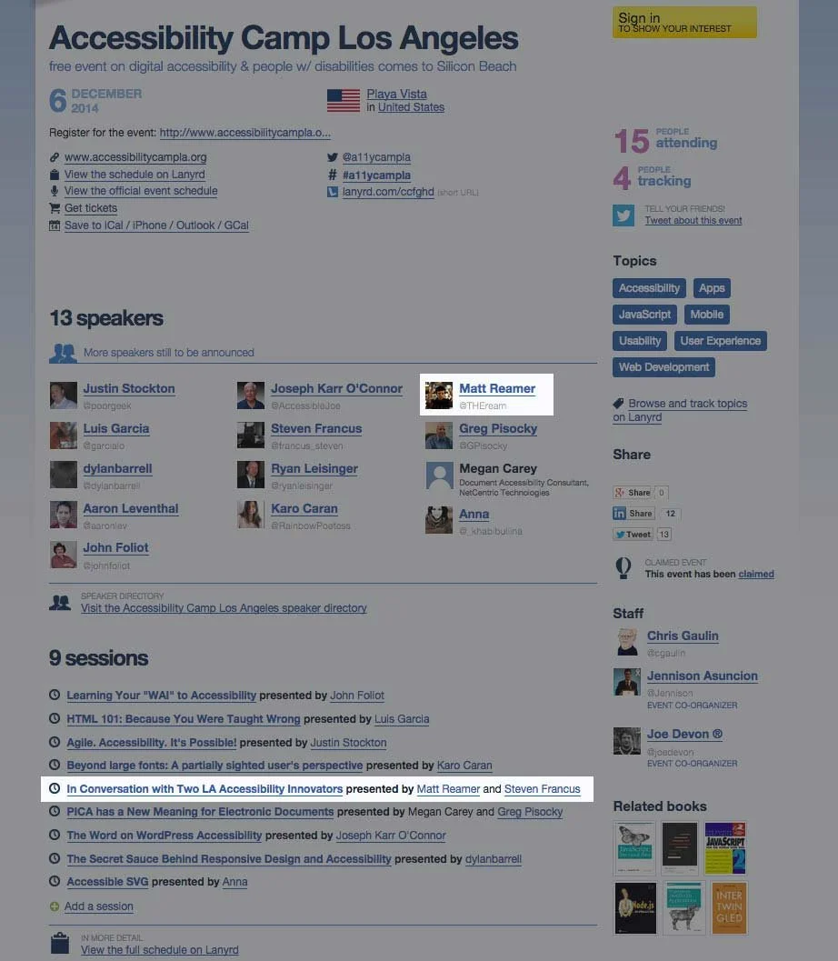
In December 2014 I spoke at the Accessibility Camp in LA held at Belkin’s HQ. I had so much fun learning about accessibility best practices in web and application design as well as got to share my story and take on designing for the disabled. After, I was asked to attend the next camp and speak up in San Francisco at Linkedin HQ which was really exciting.
PaperProto
To some, paper prototyping might seem a little archaic. I mean, with all the tools available for you to digital prototype and add functionality, why would you spend time with pencils and paper? While I do use these digital tools, I start every project by sketching a few pages of high level wireframes. This works great to get the initial design out my mind and onto paper but it's missing one thing, perspective.
Paper prototyping is an efficient way to quickly express your vision in a way that is in perspective to real use while promoting an agile workflow. Inspired by the Internet famous IronPhone we thought there was surely a 3D printable model to use for paper prototyping, but there was none. So, we made it. The .ZIP file contains the .STL and .PDF so you can get started quickly mocking up awesome mobile experiences.
The Design
This tool took a couple months and multiple iterations to design and get right. We hope to keep evolving this tool and giving the updated versions free to our peers. Another reason we designed this tool was for the college students. Our graduate school VCU Brandcenter has a UX class and we felt this tool would help teach the first years how to quickly paper prototype.
To promote this free tool to our peers in the industry, Donnie and I designed and developed a website, paperproto.com where guests could experience a digital version of the tool, download the .ZIP file and buy the tool from Shapeways if they do not have access to a 3D printer.